Data Visualisation on Artists' Migrations. Research in Progress

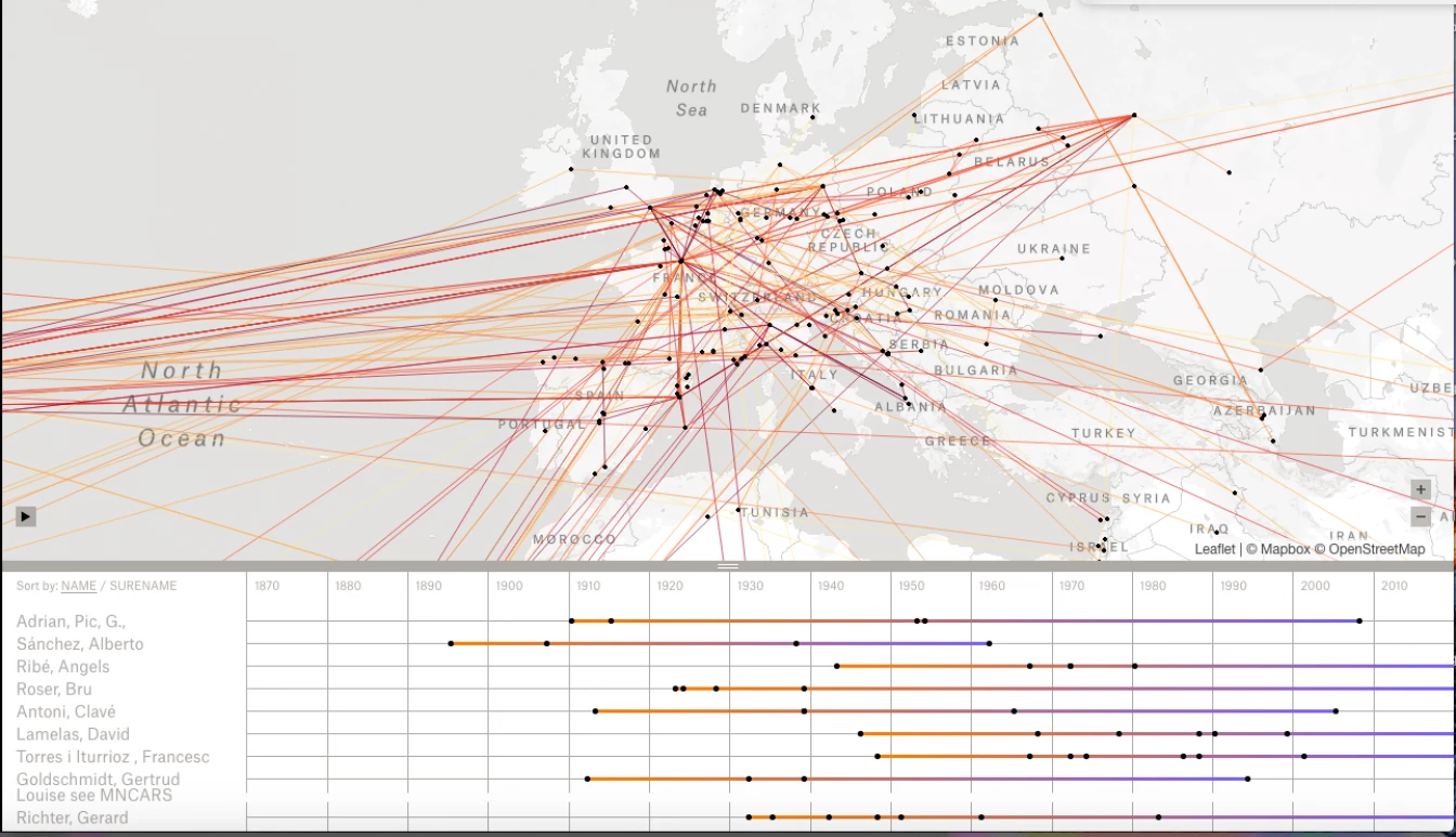
Map from the project "Mapping Collections" by L’Internationale.
Mapping Collections is a data visualisation, initiated by L'Internationale as a tool in progress. It is based on data about the migrations of artists, represented in the collections of L'Internationale partners. The information is based on data from the different collection information systems of the partners, complemented with research on a selected group of individual artists.
As a graphic device, data visualisation is an interesting tool with which to mediate knowledge. By reconfiguring facts and figures in visual form, new interpretations can be discovered and unlocked. Configuring facts in different constellations invariably raises other perspectives and lines of inquiry. We asked ourselves if an instrument like this could be used to visualise information about migrations of artists in L'Internationale collections and how that information could be interpreted.
First of all, we had to define migration. According to the Oxford Dictionaries migration is "the movement of people to a new area or country in order to find work or better living conditions". In our research, only movements for a period longer than six months were taken into account. Researching the different collections information databases, it became clear that most partner museums don't document the movements of artists. Data were restricted to the year and place of an artist's birth, and if applicable, of their death. So it became clear that for a general overview of movements, additional research was needed. We decided to use the knowledge of the curators from the different institutions and asked them to select between ten and twenty artists from their collections, that had migrated at least once in their life. We composed a list of eighty artists and made a list of their movements, including the place they moved to and the date. To contextualise their movements, we created a timeline with important or influential historical events. This historical timeline is given to complement the artists' biographies and speculate on their possible reasons for migrations, whether it is economic, political or personal. Both sets of data were included in the data visualisation.
This data visualisation was designed by Joost Grootens who is specialised in this field in Amsterdam. He used a map of the world and added the possibility to read the information in time. This connects the age of the artists and their movements with events happening in the world and places becoming more attractive to move to. The data visualisation that you will find here is a first version.
What can we learn from this data visualisation? What information does it generate and how can we further develop it? Because the selection of artists is essentially subjective, the resulting map gives only a preliminary overview of the different cultures and contexts the artists in our collections are and were part of. Further development could involve adding information about artists' works in the different collections and making a connection between the date of migration, the date of production of the artwork and the date of acquisition. It could also be interesting to compare the migration of artists with broader patterns of societal migration. What percentage of the different migration streams corresponds to artists?
Through their artworks, varied cultures and contexts are represented in our collections and enrich the cultural heritage of our institutions. Sometimes art can tell us how migrating influenced an artist's life, practice and perspectives on the world. As examples, you will find a text on one artwork from each collection featured on the map.
What we present here is a proposal. We welcome your thoughts and suggestions.